
Small businesses need digital tools that are simple, affordable and easy for customers to use. Why Every Business Needs a Mobile-Friendly Website is an important topic because it connects directly with serving customers who search and contact from their phones. When customers can understand your business quickly, they are more likely to call, message, visit your website or ask for a quotation.
A mobile-friendly website allows customers to browse your services, read important information and contact your business easily from any smartphone. Because many people now search from their phones, a difficult mobile experience can cause potential customers to leave before calling, messaging or requesting a quotation.
This guide explains why every business needs a mobile-friendly website and provides practical improvements for small businesses, shops, freelancers and service companies. Clear text, fast-loading pages and easy contact buttons can build trust and turn more mobile visitors into enquiries.
Table of Contents
What This Means for Your Business
A professional mobile-friendly website can improve customer trust and generate more calls, WhatsApp messages and enquiries. Visitors should be able to understand your services, read the text and find your contact options without zooming, rotating the phone or struggling with a complicated menu.
Mobile usability also affects how customers experience your business. Pages should load quickly, images should fit the screen and buttons should be large enough to tap comfortably. When these basics work properly, customers can move from searching to contacting your business with fewer obstacles.
Why It Matters in 2026
Customers increasingly compare businesses using their smartphones. They may check your website, Google profile, reviews, prices and WhatsApp contact before deciding whether to enquire. If a page loads slowly, displays tiny text or is difficult to navigate, they may leave and choose another business.
A mobile-friendly website is therefore an essential part of your business identity. It creates a smoother customer experience, supports better visibility in Google Search and provides a stronger foundation for SEO, advertising and social media marketing.
Key Benefits
- Gives smartphone visitors a clear and comfortable browsing experience.
- Makes text readable without requiring customers to zoom.
- Keeps menus, forms and buttons easy to use on smaller screens.
- Helps pages and images load efficiently on mobile connections.
- Makes call, WhatsApp, email and location actions easy to find.
- Supports stronger visibility in Google’s mobile search results.
- Can increase enquiries by reducing frustration and abandoned visits.
A business that is easy to contact has a better chance of receiving enquiries. A business that looks professional has a better chance of building trust. A business that keeps its information updated has a better chance of appearing reliable when customers compare options.
Practical Checklist
Use this checklist before publishing or promoting your business online:
- Open every important page on a real smartphone.
- Confirm that text is readable without zooming.
- Test the menu, links, forms and contact buttons.
- Make tap targets large enough and leave space between them.
- Compress large images so pages load faster.
- Keep headings and paragraphs short and easy to scan.
- Avoid pop-ups that cover most of the mobile screen.
- Place call and WhatsApp buttons where visitors can find them easily.
- Check that forms work without horizontal scrolling.
- Test the website on different screen sizes and browsers.
- Use Google PageSpeed Insights to identify mobile performance problems.
- Recheck the website after theme, plugin or content updates.
Common Mistakes to Avoid
A common mistake is designing only for a large desktop screen and assuming the same layout will work on every phone. Tiny text, crowded menus, oversized images, horizontal scrolling and buttons placed too close together can make a website difficult to use.
Businesses should also avoid slow-loading pages, intrusive pop-ups, complicated forms and important contact details hidden near the bottom of the page. Test the website regularly instead of relying only on the editor preview, because real smartphones and mobile connections may reveal problems that are not visible on a computer.
How Djeema Digital Marketing Can Help
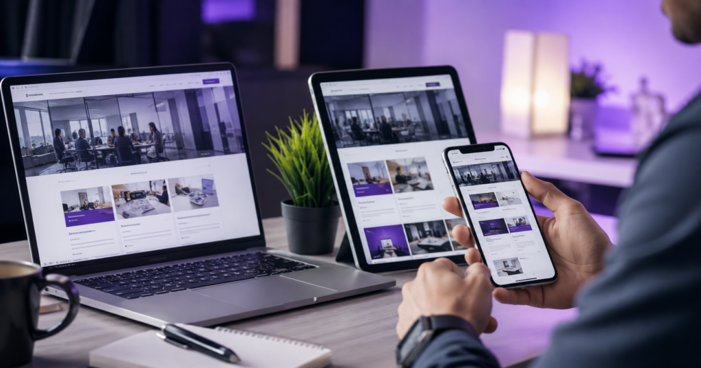
Djeema Digital Marketing creates responsive websites for small businesses that work smoothly across mobile phones, tablets and desktop computers. We focus on readable content, fast-loading images, straightforward navigation and clear call or WhatsApp contact actions.
We can also review an existing website for mobile layout problems, broken links, slow pages and difficult forms. Our website design and SEO support helps businesses present their services professionally and makes it easier for customers to enquire from any device.
Useful Internal Links
You can explore more Djeema services here:
Useful External Resource
For additional guidance, read the official resource here: Google Core Web Vitals.
Conclusion
A mobile-friendly website is essential for any business that wants to serve customers who search, compare and make contact using smartphones. Clear text, fast pages, responsive images and simple navigation can improve trust and prevent potential enquiries from being lost.
Test your website regularly on real mobile devices and correct one issue at a time. A reliable mobile experience supports stronger customer engagement, better search visibility and sustainable business growth.